

About
It has always bothered me that privacy has no unified symbol. Every community has their own take on how privacy should be visualized. I want to unify the privacy community across the internet. It is my belief that, with a universal symbol for privacy, we will grow stronger. We will have a symbol to represent us. We will have a flag to fly.
Icon
The icon is a clipart created by librarian Gordon Dylan Johnson which can be found here. The size of the icon is large enough to still fit if the flag is cropped to a square/circular aspect ratio.
Dimensions
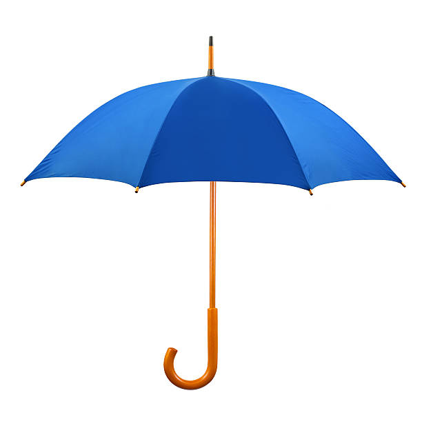
The size of the flag is 140 by 90 centimeters. These dimensions are chosen because of the dimensions of a Tor Browser window (1400x900 pixels).
Colors
The color blue (Azure) was chosen because it symbolizes security, stability, and reliability. The exact shade of blue used is the same azure color used by the flag of Europe, because of GDPR.
Design
This flag follows the “Principals of design” for vexillography.
Use it!
Use this flag for group chats, communities, profiles, stickers, patches, articles, wallpapers, real flags, anything you want to! Spread it around so it becomes a global icon for privacy. Even put it on the Wikipedia page for privacy if you can!
I don’t like it. It screams “FINGERPRINT ME!”
A symbol for privacy should imply privacy. Not show things that which should be protected. (like your handprints or fingerprints)
You are a dreamer, and this is exactly what we need. Two hands up for that.
But before designing a flag, we first need to agree on the symbolism.
There are two types of symbols. Anti symbols and pro symbols.
Anti symbols are easier to make, because they comes from reaction. Its easy to see whats wrong. “anarchism is order” and “stop war” stickers are anti symbols.
But pro symbols are harder because they require us to understand what we are fighting for. The rainbow flag and the aboriginal flag are pro flags, because they show what they are fighting for. The rainbow flag fights for diversity, while the aboriginal flag establishes a connection between people, land and the sun.
In short, I believe that a pro symbol would be better for gleedening people into the struggle.
With this in mind, I think we should fundamenrally understand why privacy matters, and make symbols out of that.
I like it, but a slightly more stylized hand would suit my tastes better. Either way though it’s good to have. I also think yellow and black would be better to symbolize the importance and danger of privacy decay.
While i like the idea, this flag gives instant super-creepy vibes, i would NOT like to use it unless it’s for a bad guys faction in a game or story or something like that
i thought privacy have flag - anonymous
I get your point and idea. And I agree, there should be a symbol. But in a world full of symbols, where there is lot of symbols that overlap or mean the same thing, it’s not a great thing to ad more symbols.
I would suggest, that people instead use the symbol for human rights. https://en.wikipedia.org/wiki/Human_Rights_Logo

This logo stand for rights and freedom, which is not in opposition to anything, but for something. Article 8 in the Human Rights, are about the right to privacy:
This should be enough. I’d suggest people use this, and support human rights in general.
I loved the idea, but I object to the symbology.
First off, we’re against being seen. Why would we want a big creepy eye as the definition of success? Did Pirate flags show shackles and gallows? Of course not.
What are common pictograms associated with privacy? Shields. Locks. Locks on shields. Privacy is about defense and control.
Second, the blue gives me BSOD vibes. I get the EU reference, but black is super obvious here. Black it out. Redacted. Blind. All right there.
My suggestions? A shield or lock with dove at its center. Because the mass surveillance state is one of fear, not freedom or peace. Black field with blue and white stripes, white representing freedom, blue as you have it, and I guess giving a nod to Estonia’s leadership in EU tech. Not that we need to rep Estonia, but I also liked their Eurovision entry this year.
You know what this flag needs?
Espresso Macchiato
I was going to bet anything I was going to click and it would say “More cowbell!”
Pleasantly surprised, thank you.
Not sure about an icon or flag to depict the idea of announcing Hey I’m For Privacy!! Feels like it goes against the whole principle. It’s along the same lines of stickers on a vehicle, stick family tells (most times) exactly how many people and animals w/types are within the household, gun logos indicate a high probability of an abundance of weaponry, a privacy flag may promote someone to look deeper into you with the premise well they want privacy so they must have something to hide, mentality. I’m private I don’t need to draw attention to me being private. But you do you. Just my opinion.
A flag should be easy to draw: I’d replace the hand with a stylized fingerprint.
Definitely not a fingerprint imo: that denotes traceability.
Fingerprints are harder to draw as a hand, maybe a hand with raised middlefinger.
Going to be an unpopular opinion here. But i think the mixing of sharp curves, with very pixelish, textured hand is not really playing well together. Mixing these two styles are not easy and I have tried and failed several times. So I don’t think I can help much. But this really needs some rework IMO. I know this is not your artwork, so I’m just expressing what I felt.
Agreed, not a fan. The hand would look better if it wasn’t aiming for realistic contours, and instead was more cartoon-ish
i came to say something similar. its kind of bad. this comm’s logo would probably make a better flag.
I really like the idea of a flag to unify the privacy community but I’m going to go with the consensus with the hand: it’s probably a bit too complex. I think a flag should be easily made into a vector format that is easy to draw and replicate.
Say if someone wanted to draw a protest board with this on it. It would be really difficult to accurately draw the hand without good drawing skills.
My proposals:


This flag follows the “Principals of design” for vexillography.
Except…
6. Seals, coats of arms, or logos are usually too complex to be used effectively on a flag, although exceptions exist
Controversial opinion: those guidelines are poorly defined and ill advised made by a particular group of heavily anglo-american centric people and promoted by a few YTers and shouldn’t be taken like fucking gospel
first thought that came across my mind is the Black Hand of the Brotherhood of Nod
I guess it’s nice that it follows the principles of design for flags, but it still looks off somehow. the minimalism of the eye vs the more detailed hand print seemed at odds.
A simpler less detailed hand print IMO would look better. Like the Black Hand of Nod. also less detailed Hand print = less/no fingerprinting across internet
Yeah the hand is way too complicated and hard to identify from far away. Also, proper identification requires some amount of wind, which is not the kind of dependency you want to integrate into your flag design. That’s why stripes are so common.
I’m pretty sure every kid in kindergarten knows an easier way to draw a hand.
Black Hand of the Brotherhood of Nod
Empire of the Hand from Star Wars.
Added: yikes, lots of black hands, many unsavory.
Those are some fucked up palm lines. Heart line is okay ish, strong. Head and life lines are… I don’t event know if those have a boilerplate reading they are so unnatural. This pirate might be headed for the love of their life or an early, traumatic death. Godspeed.
On a more serious note, I would suggest you consider simplifying the hand to a solid hand. The hand as-is would be very difficult to reproduce and draws attention from the overall flag design.